Menu
  • To admire, study, and critique

    Two noteworthy XHTML/CSS redesigns have recently launched: Macromedia – The good and bad wrapped into one. Good: Clean, airy, pleasing color combinations, fun imagery, classic Macromedia typography, aesthetic, and balance. Heavy use of Flash, but no excessive animation. Bad: The ~200 words

  • Go Dutch

    I’ve always loved the pure design and typography from the Netherlands. Filled with a balance of beautiful form and practical function, and wonderfully obvious information hierarchy, Dutch design always evokes an emotional reaction within me. Granted, my personality slants ~300 words

  • Golden State quarter design

    When the competition to design California’s version of a commemorative U.S. quarter was announced last fall, I debated whether to enter something. Any attempt to represent something meaningful in a space the size of a coin or a 32-by-32-pixel icon ~300 words

  • Confessions of a designer

    Recounting the downward spiral and early recovery phase of a designer’s switch to the Windows operating system. ~1,600 words

  • eXtreme design

    Somehow, I recently stumbled across the controversial discipline and methodology of XP. Not another lame X-based abbreviation for the new OS from Redmond. I’m talking about eXtreme Programming, which has roots from 3 to 6 years ago, depending ~500 words

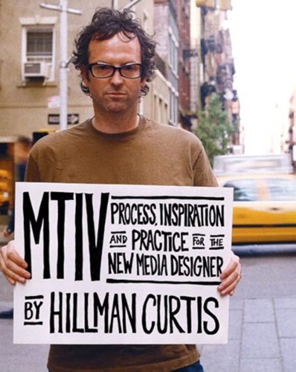
  • MTIV by Hillman Curtis

    Hearing Hillman

    After listening to Hillman Curtis speak twice today, (once for the opening keynote, and another for a session on design process) I now have nothing but respect for him, and gratitude for the inspiration he provided through what he had to say and how he said it. ~300 words

  • I|O: Interaction Only

    I just arrived in Miami for the AIGA‘s Interaction Only Conference. A balmy 85 degrees with lots of humidity took my breath away as I stepped out of the airport. I’m excited be here, and am looking forward to ~200 words

  • Time for major surgery

    I started batting around ideas for a redesign of stopdesign.com a few weeks ago. Today, I actually made progress by sketching out some rough ideas and planning a simple architecture. The site has basically remained untouched in the four years ~200 words

  • Issue-based content

    Finally had a chance over the last two days to begin thinking about the Wired magazine site design. The current site is riddled with usability problems, poor architecture, and a very awkward design. I can be brutally honest about it, ~200 words

  • Success in user testing

    My colleagues in Boston ran some users through the Wired News design prototypes this week. While we were fairly confident that many of the usability problems of the old design had been addressed, we wanted to make sure there weren’t ~300 words

  • News worth noting

    I should mention here one of the major reasons I’ve become obsessed with Web standards and CSS. My current project (as Design Director of Wired) is a complete redesign of Wired News. See a screenshot of the before state [.gif, ~300 words